Introduction
Recently, a friend of mine who went to school for kinesiology and was initially working as a physiotherapy assistant, made the transition to business owner and baker/barista.
As I sat in his shop eating a cake and sipping my coffee I was struck with how often I read and hear about people switching careers, often to something completely different than where they were or what they studied. These occurrences served as the initial inspiration for the problem space I wanted to dive into.
“Why are people picking the wrong careers?”
Design Thinking
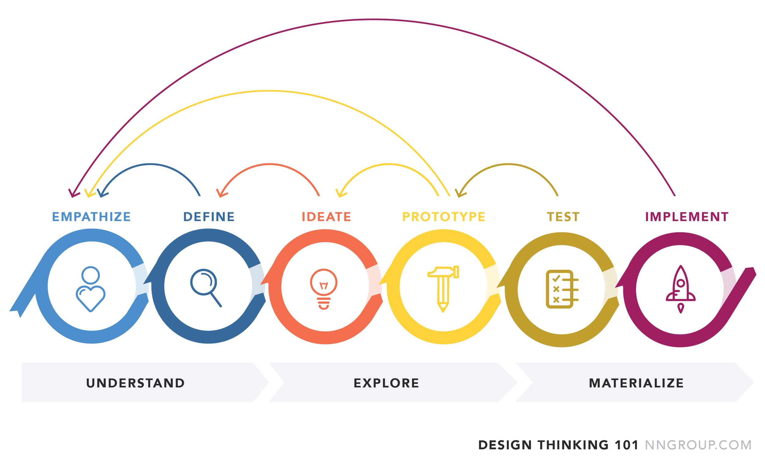
I used the design thinking principles as a guide to navigate the problem space.
This extremely iterative process begins with understanding the problem, exploring all possible solutions and then finally putting the best solution in place.
Problem Space
To properly define the problem space I set a goal of trying to understand how people feel when making that transition.
After quickly scanning some articles I found that 1 in 5 Canadians are dissatisfied with their current job, with over 3 in 5 are seriously considering leaving that job.
This situation is often a costly one as the average debt of a post-secondary graduate comes out to roughly $25,000.
Research Methodology
Secondary Research
Primarily searching for articles and surveys studying the behaviors and motivations of those selecting careers, and their impression of those careers.
Primary Research
User interviews will be the focus in the primary research section. The interviews will be catered towards validating some of the assumptions listed as well as discovering additional pain points, motivations and behaviors of 18–30-year-olds.
Secondary Research
Research Interviews
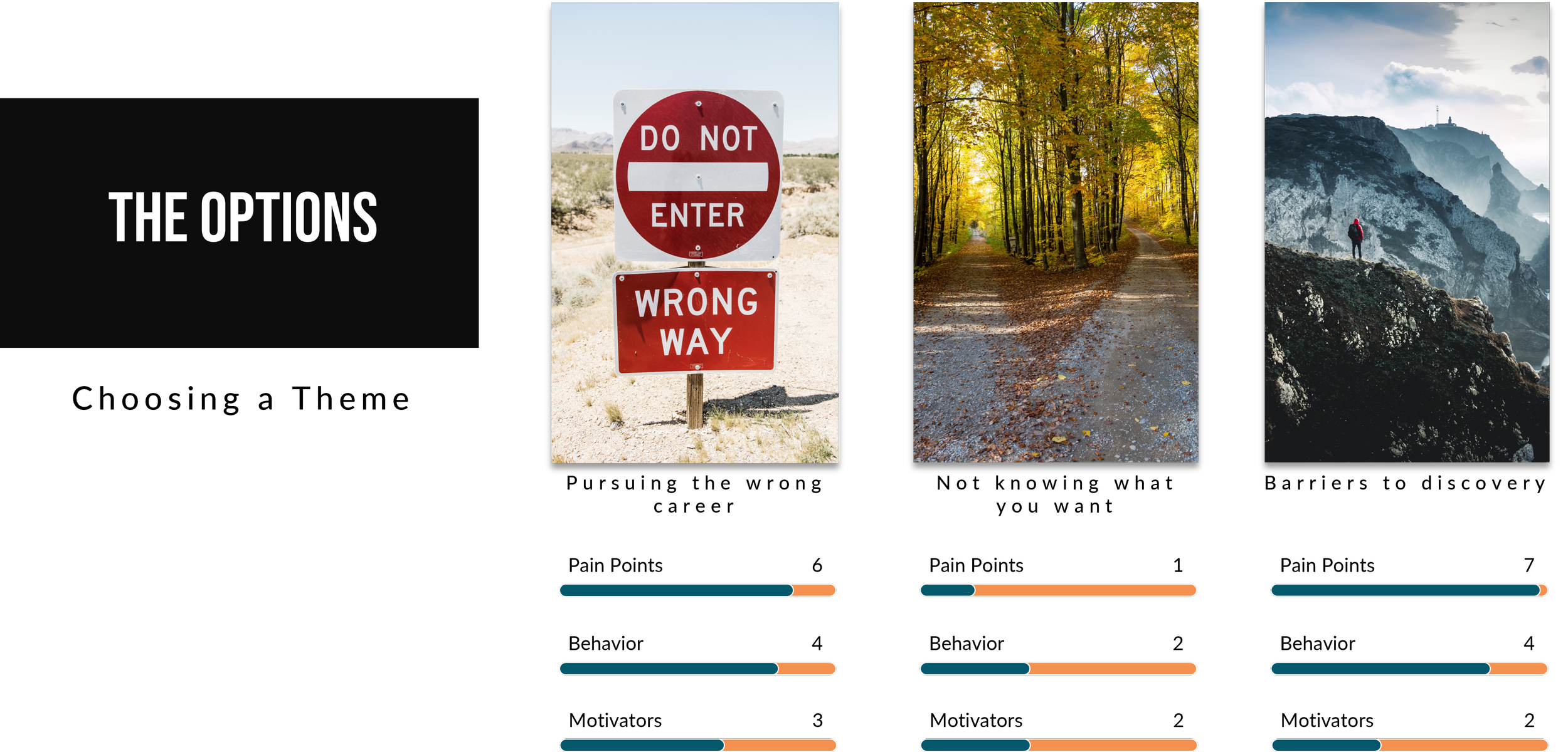
After each interview, I reviewed the transcripts to uncover the pain points, motivations, and behaviors of each interviewee. This method of synthesizing the data revealed three key themes.
Theme #1: Pursuing the wrong career
Interviewees expressed how they felt while in careers/jobs that were the wrong fit for them.
Theme #2: Not knowing what you want
Interviewees admitted to not being sure that what they picked is what they wanted. This is a direct result of them being unsure what they wanted from a career at the time of choosing.
Theme #3: Barriers to discovery
Interviewees shared that there were barriers to discovery present in the career search. The career they are in/pursuing now was simply not on their radar before.
Narrowing The Scope
I chose to pursue the “Barriers to discovery” theme as a result of considering the sequence of the career journey. Reverting back to a position of empathy for those switching careers, two elements stand out. The first being choosing a new career having already started one, and a regret for having chosen the wrong career in the first place.

The Persona
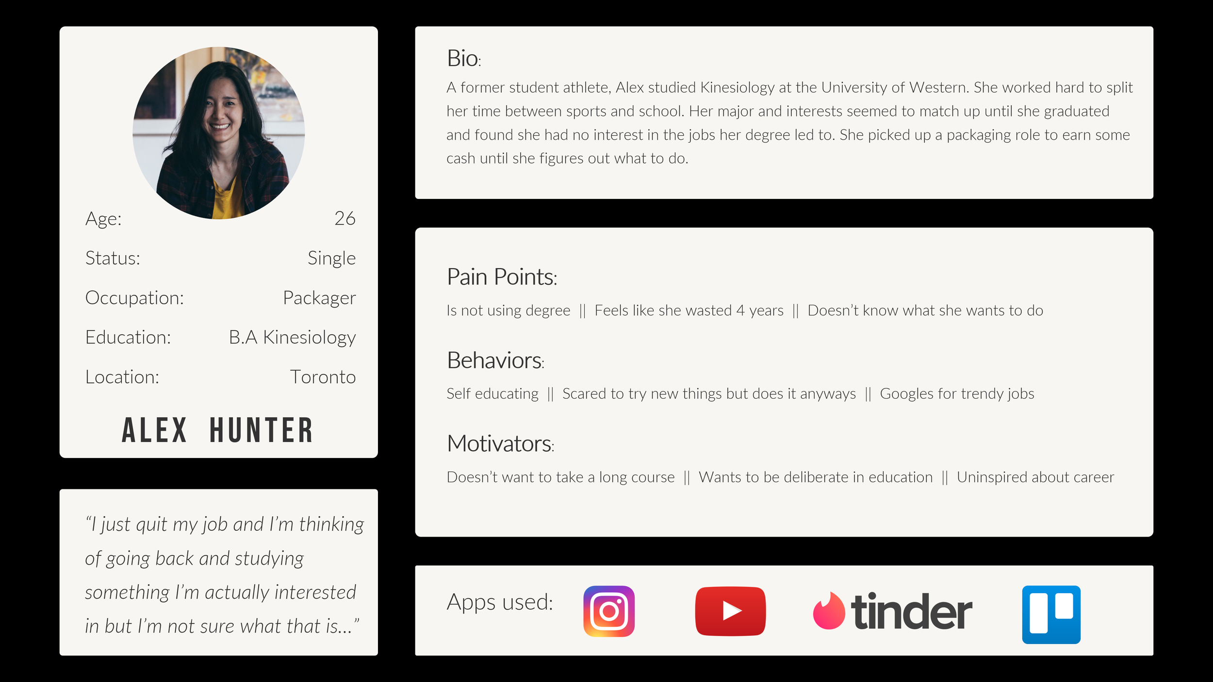
As per the Design Thinking framework, after defining the problem I returned to the empathy stage. By developing a persona I am able to humanize the problem and carry forward the empathy through from ideation to testing.
-
Alex is a somewhat recent Kinesiology graduate who is dissatisfied with her career progression so far.
-
Alex’s search has been long. She began on Google and has carried on to consulting friends and family
-
Despite the arduous search process, she is determined to change careers. However due to the challenges present in her search she is not sure that she will choose the right career.
The Experience Map
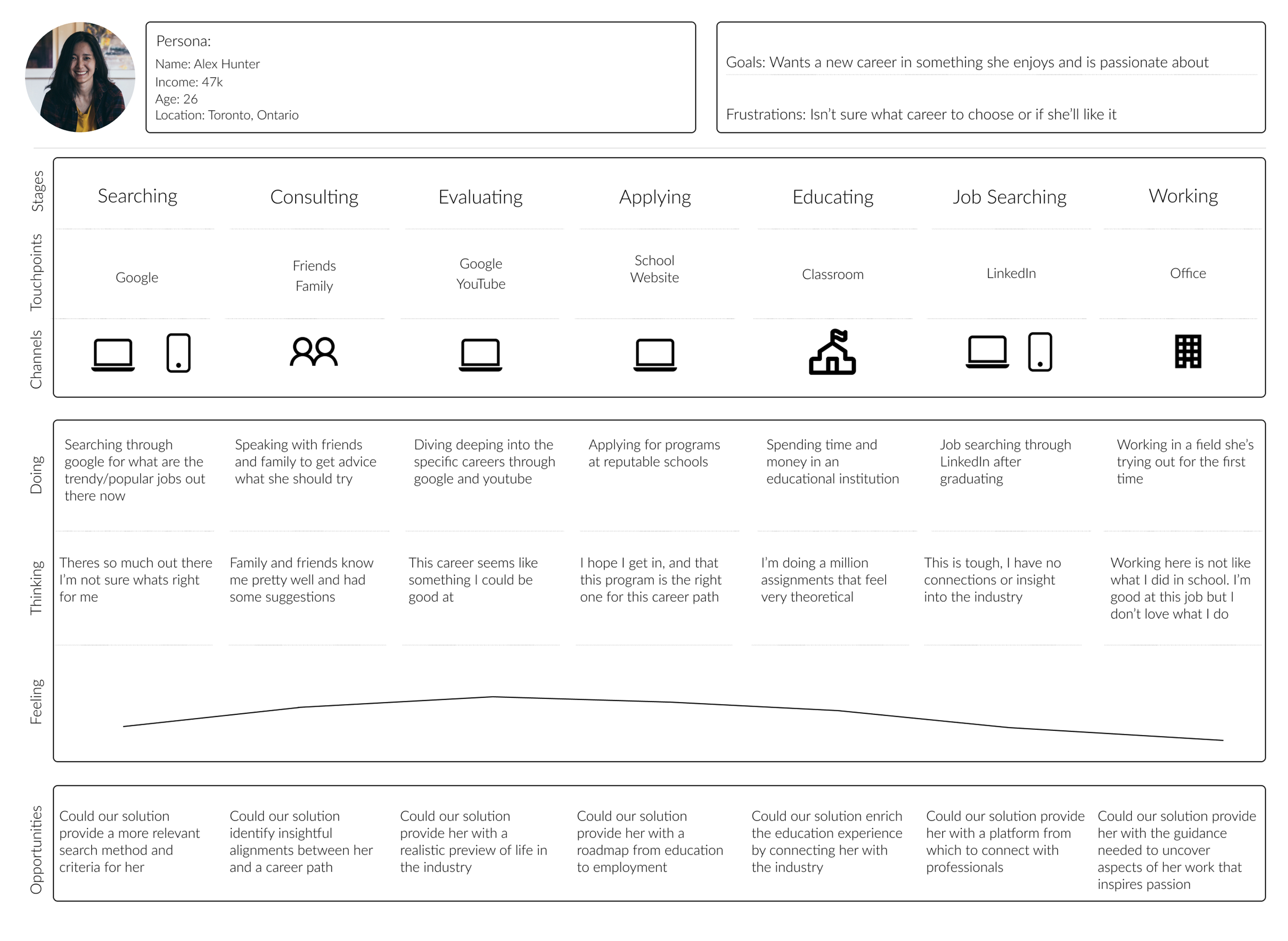
In order to sharpen the ideation process, I plotted out an experience map for Alex. This is to ensure that all solutions that result from the ideation process will fit in with Alex’s process and improve her experience.
Experience Map Learnings
The current state of Alex’s map will likely result in her not feeling fulfilled with her career choice.
She has not explored enough options
She can’t confirm that the new career aligns with what she’s passionate about
She has no way of experiencing what that career actually feels like
So to fix this aspect of the experience map, I began to brainstorm solutions that would empower Alex as she looks for her next career.
Beginning the ideation process
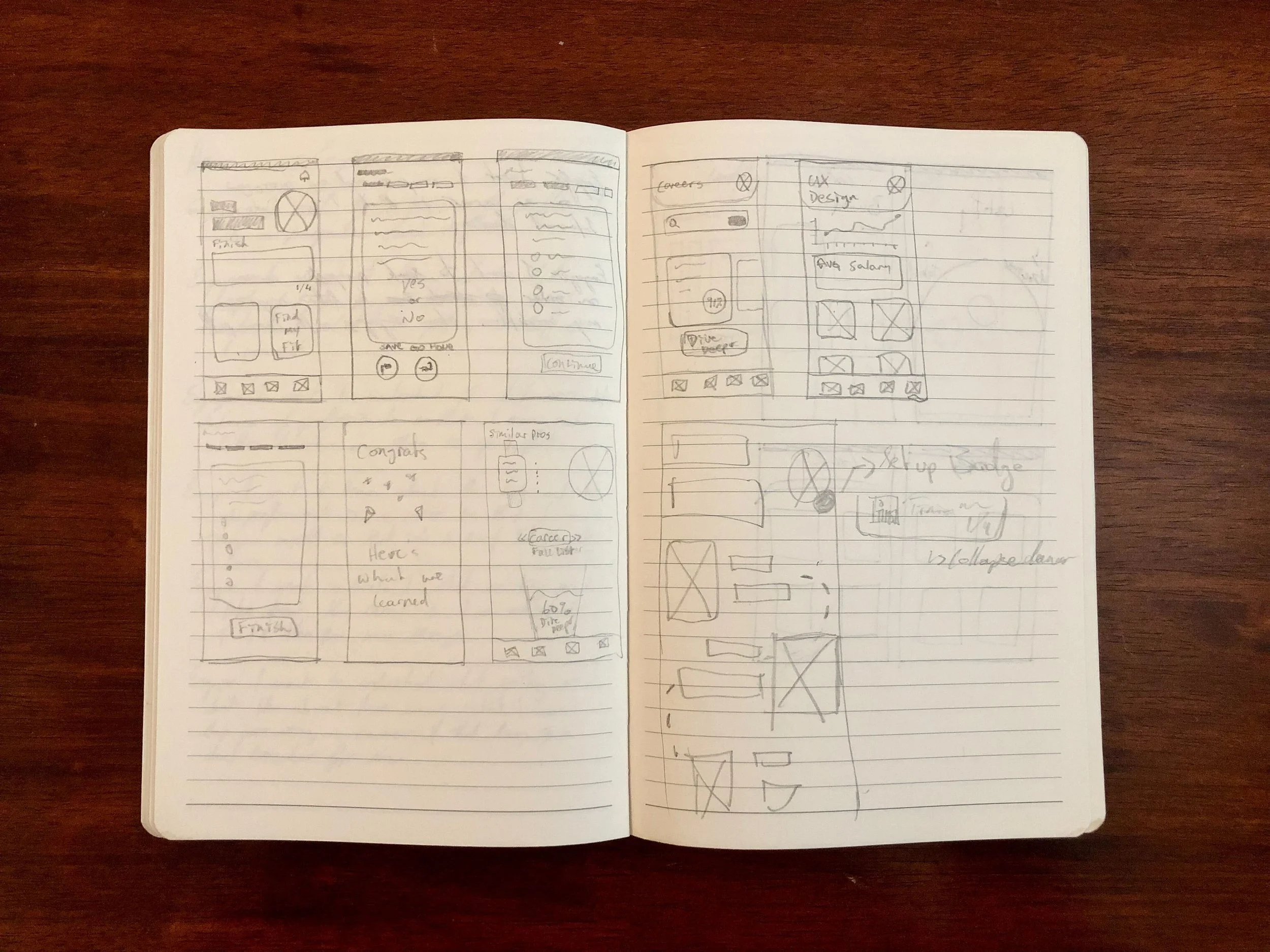
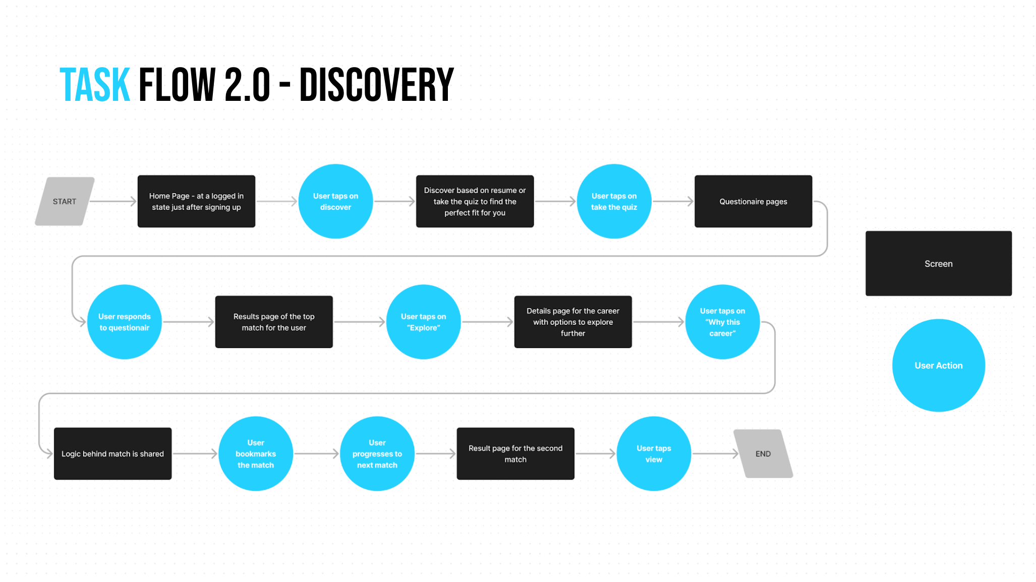
As per the Design Thinking methodology, ideation must be followed with prototyping and testing. To this end I began to explore what task flow Alex might experience. This task flow led to sketches which would enable me to test out this aspect of the solution.
Sketches
Before landing on what this solution is going to look like I considered the apps that Alex would use. Drawing inspiration from there I began to sketch what this solution would look like.
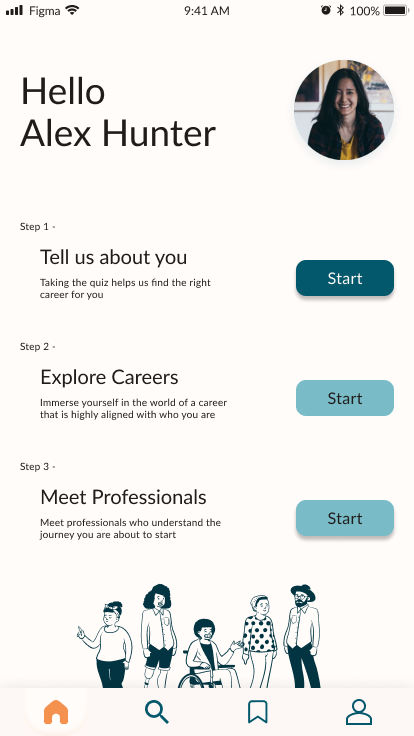
The solution sketches seen below served as the baseline for the mid-fi prototype that was tested to evaluate the task flow and design elements.
Mid-Fi Prototypes & Testing
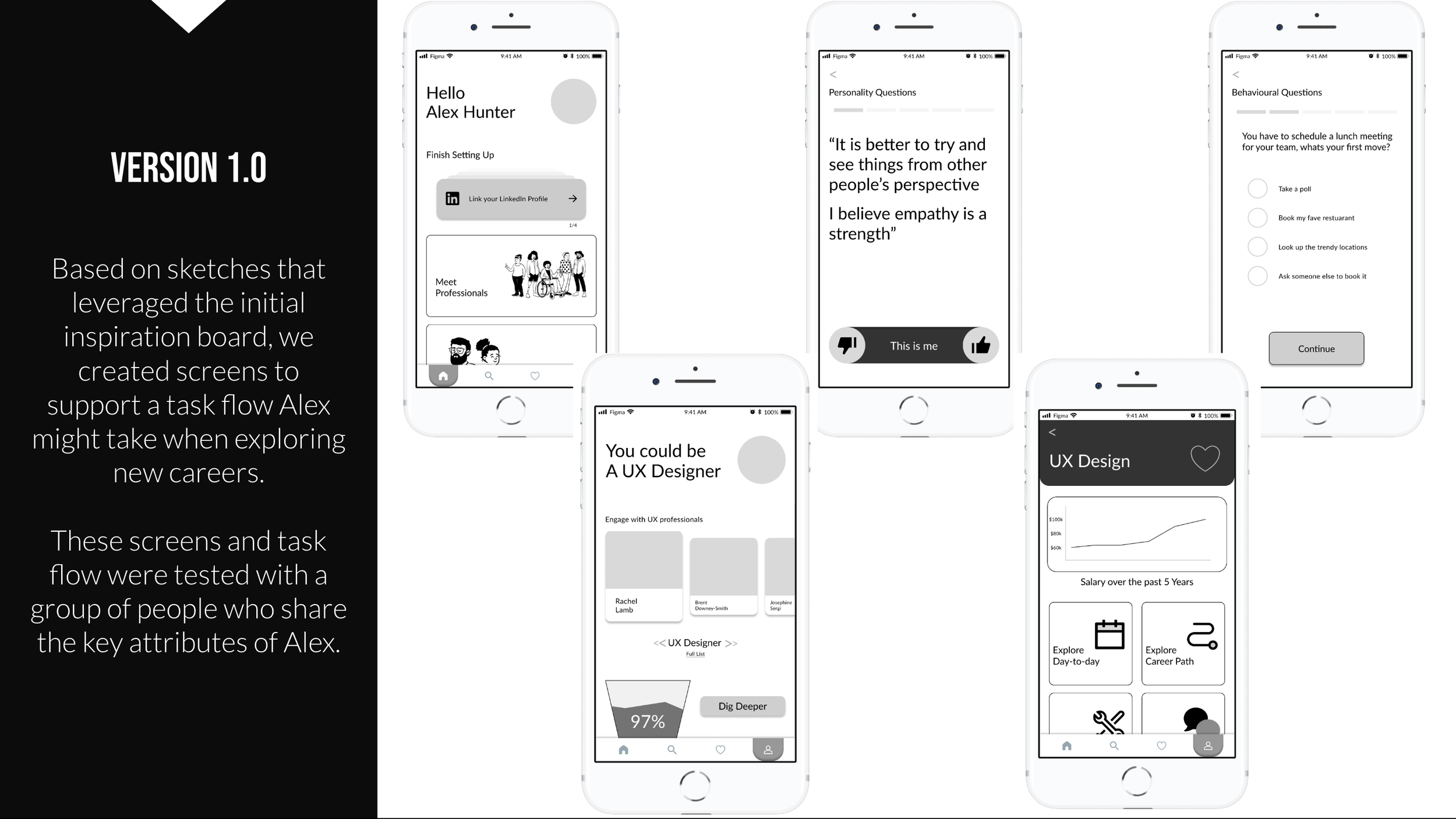
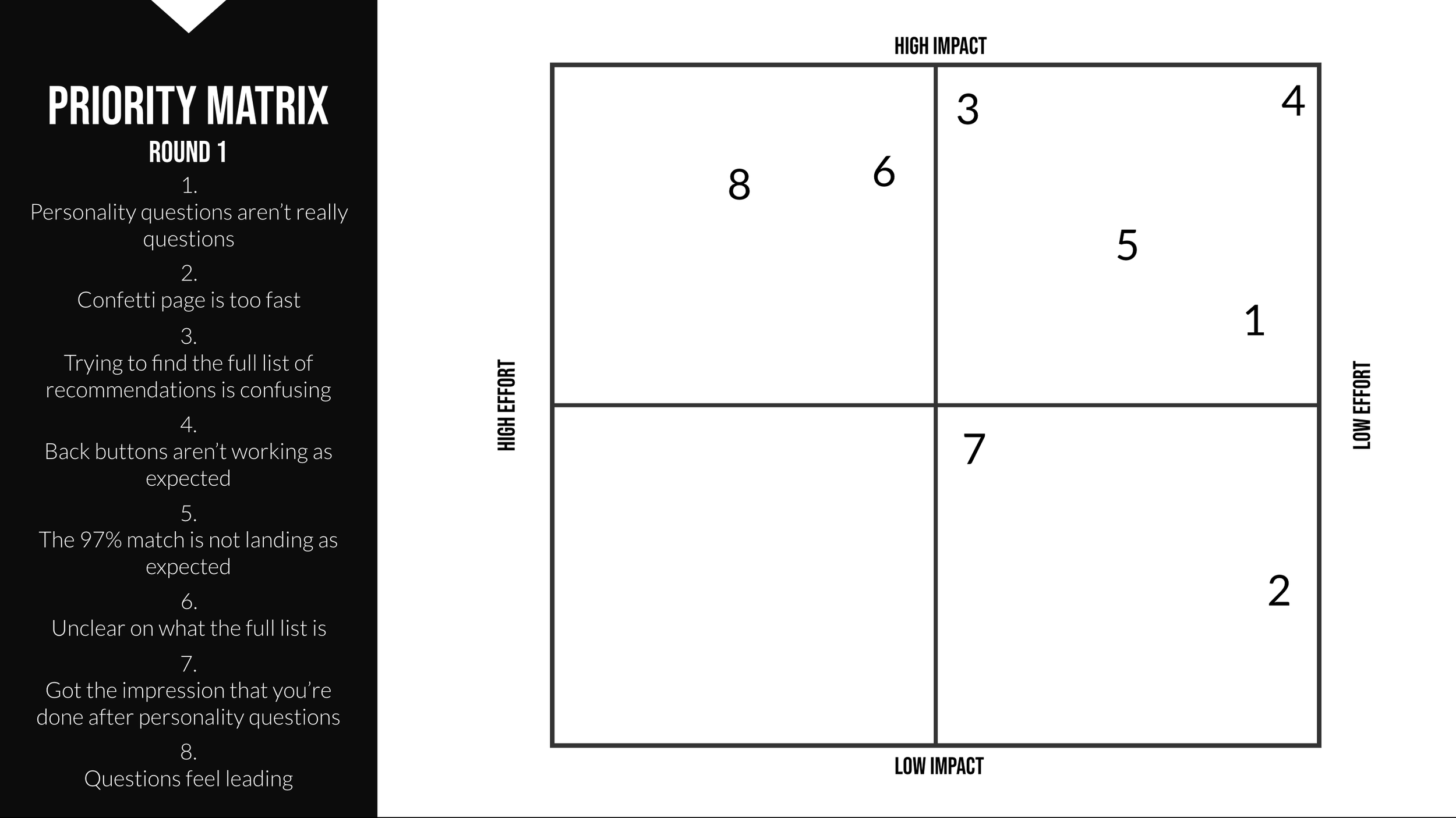
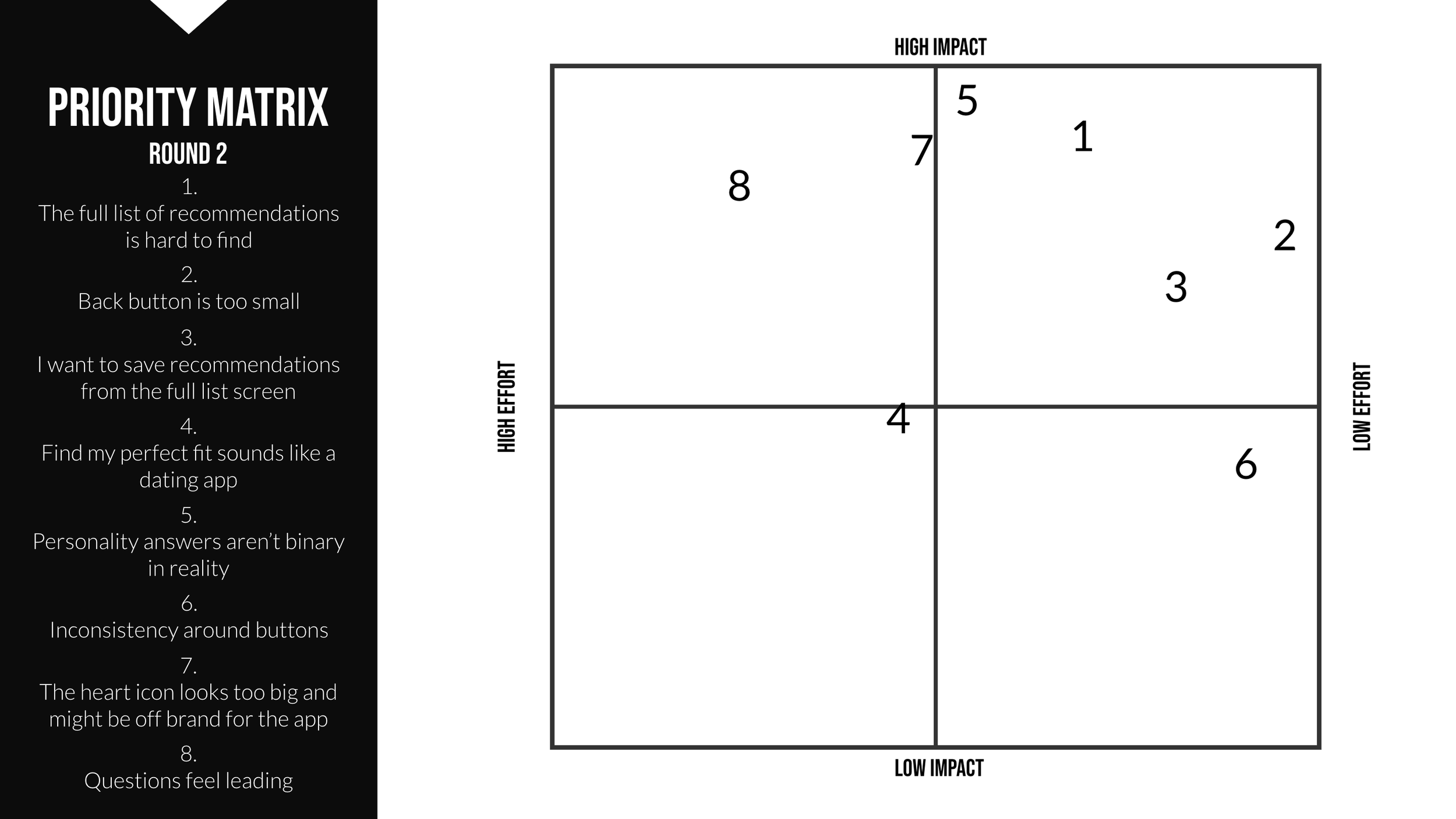
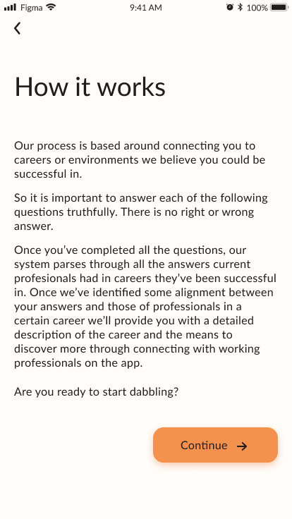
Based on the solution sketches I was able to build out a mid-fi prototype to test how users would engage with a solution like mine. The testing results for each version were plotted on a priority matrix which informed where I would direct my efforts when making improvements.
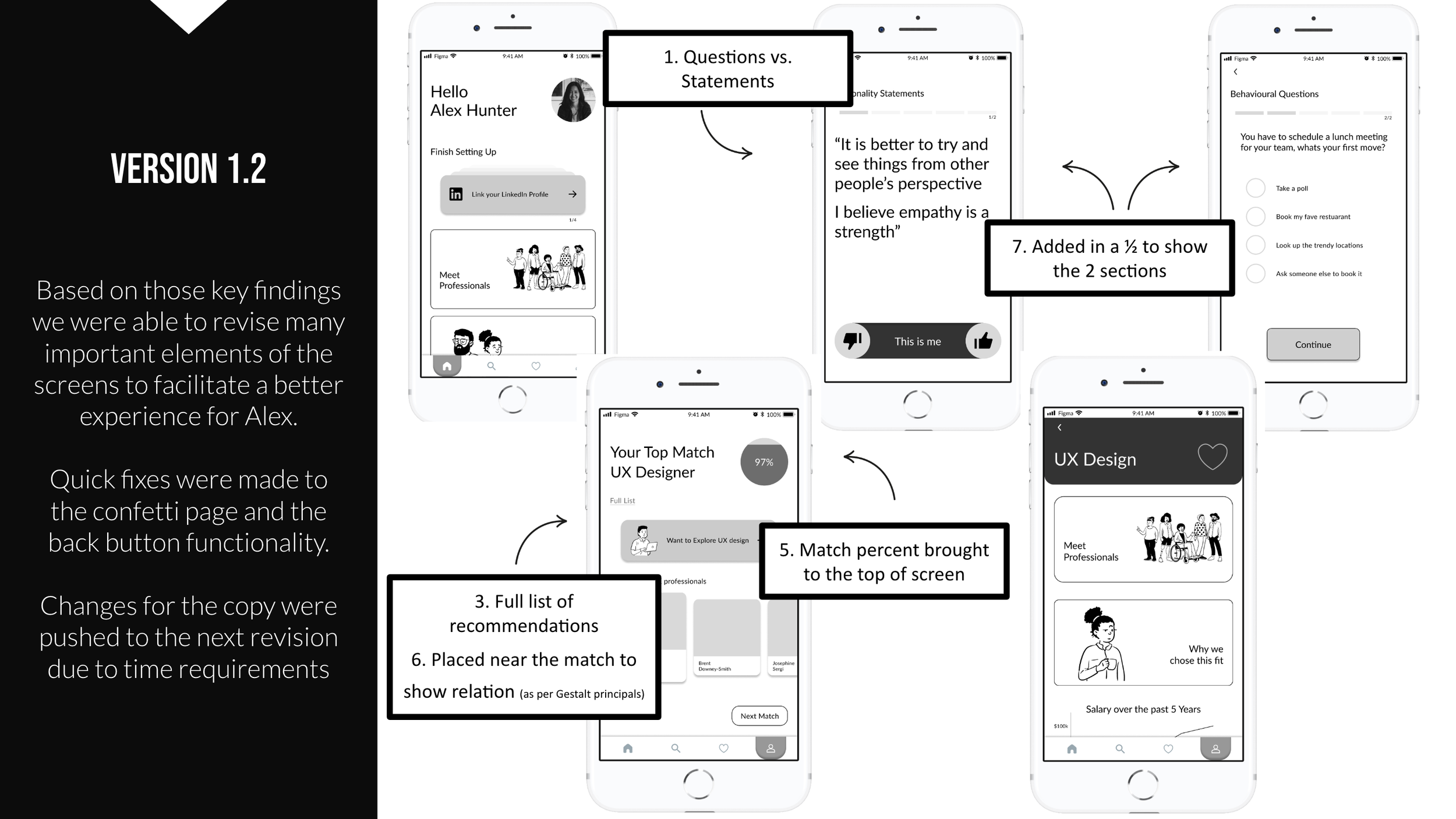
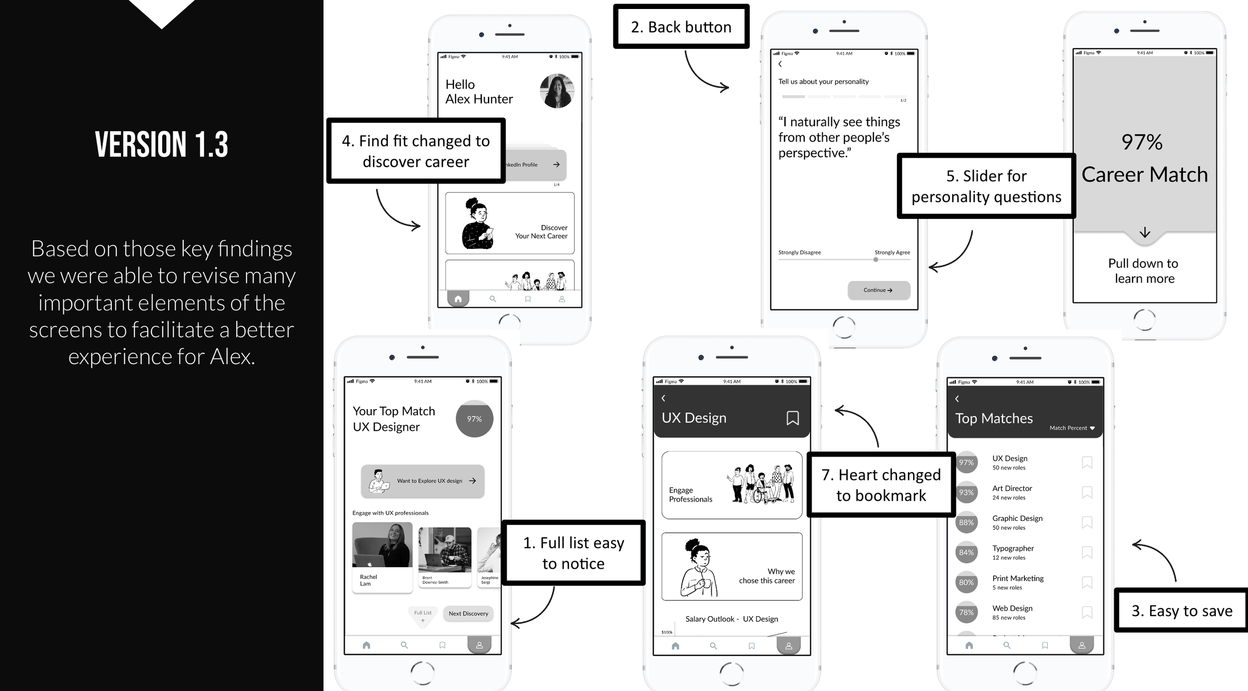
Based on the results of testing I was able to adjust the task flow to something that better aligned with the expectations of someone like Alex.
User Testing Results
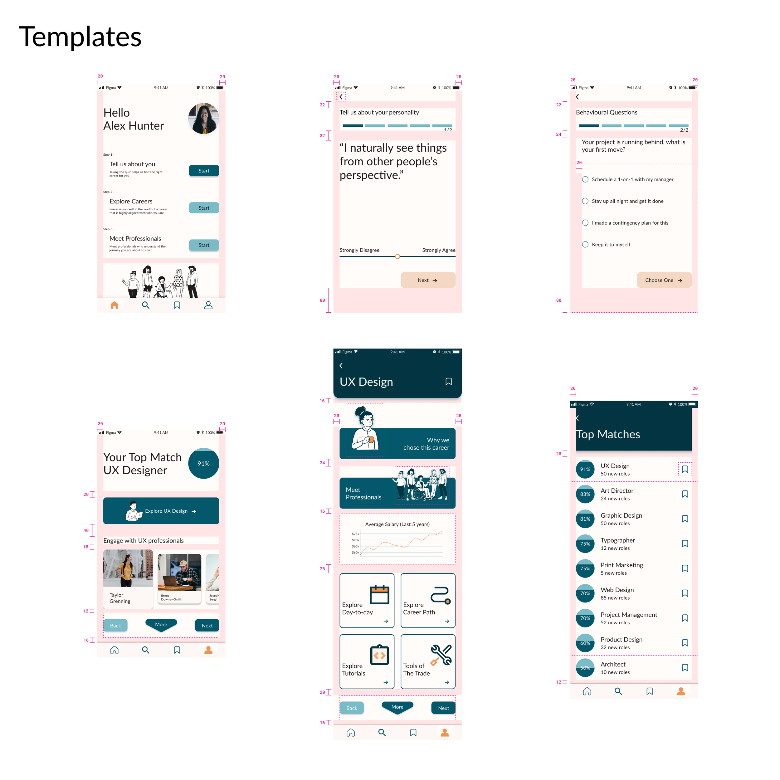
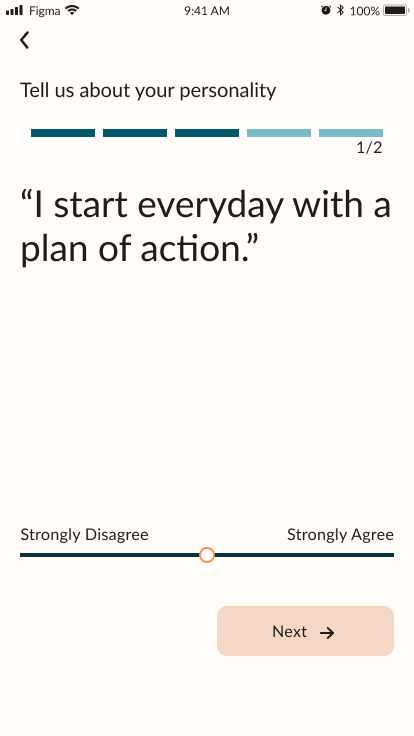
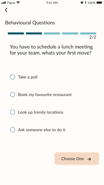
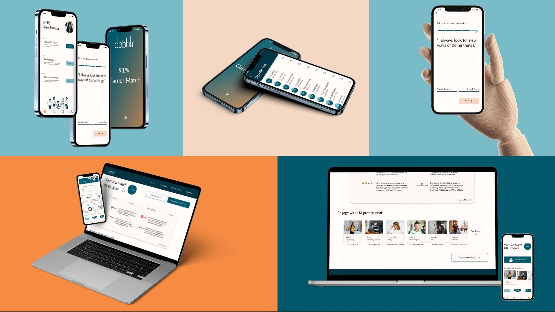
User Testing not only influenced how the app looked but also how the overall solution functioned. Initially career paths or jobs would be tagged with certain characteristics and based on the responses of a user they would receive recommendations for careers that featured tags that reflected their answers. However user testing showed that the responses should not be binary. From a visual perspective it meant a slider that allowed a user to show just how much they agreed with a personality.
From a functional perspective it forced a review of the interviews conducted and an evaluation of whether using a tagging system was the most effective way of solving the problem of users. This re-evaluation inspired a move from a tagging system to using a k-nearest neighbors algorithm (KNN) algorithm in the back-end to match a user’s responses with existing professionals' responses. This method would also give additional qualification to the percentage match metric moving forward and ensure the solutions scalability.
Visual Identity
Branding the solution plays a major role in not only defining how it will feel for Alex to use the app in the future but how users like Alex may then discover the app and be inspired to use it.
Brand Name
Taking into account the subject matter of the solution, the key findings from user interviews, and the mood board and color scheme, I landed on the name “dabblr” and the brand. Derived from the verb dabble, I believe it encapsulates the desired outcome of the solution while positioning it as a light and easy to use platform.
The name is misspelled intentionally as it will be easier to copyright and reduces it to an even number of letters for the purposes of symmetry which will make it easier to use in a number of potential branding senarios.
Mood Board
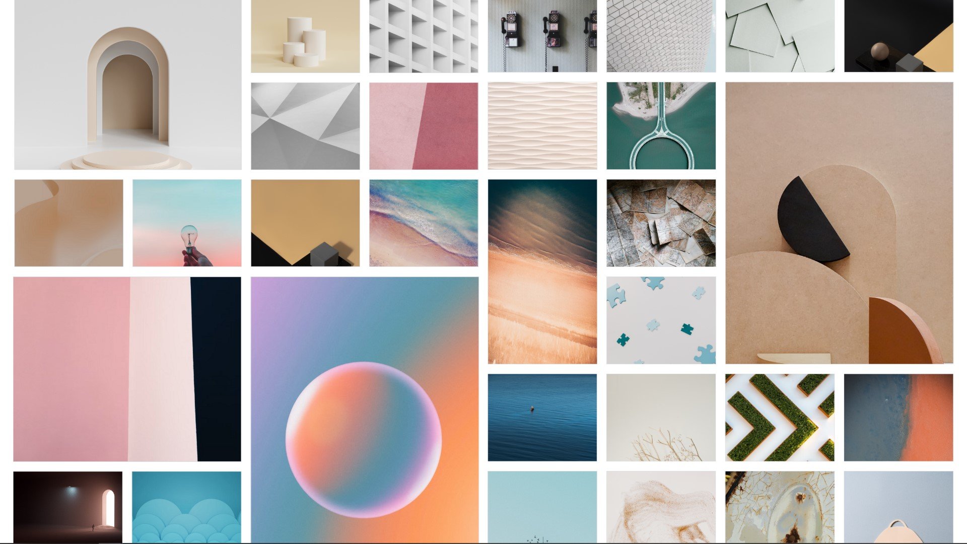
The mood board focused on how the solution relates to the emotion present throughout the existing task flow for users like Alex. I build this board considering both how Alex might be feeling before using the solution as well as how she should feel while using it.
From the mood board I pulled a color scheme that would reflect the kind of brand that would best align with Alex.
Design System
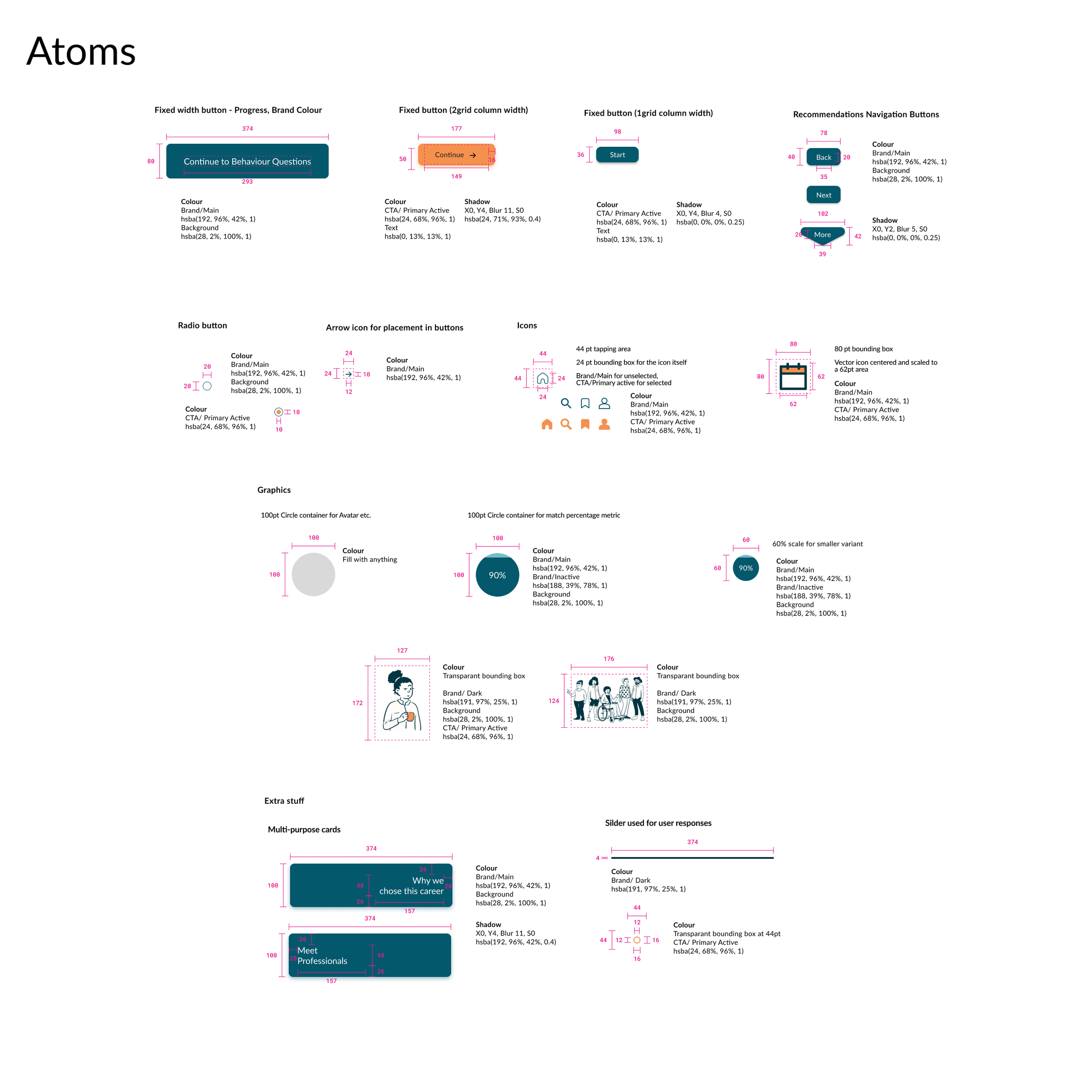
Building the design system for the app was incredibly rewarding experience. The more I explored the component system of Figma, the more I was inspired to standardize everything and bring a level of consistency that would be expected of a professional app.
I used atomic design principals to build a system that promoted readability and navigability throughout the app.
WCAG in the Design System
When using the brand colours in the system I used the Web Content Accessibility Guidelines to ensure that all copy was accessible to all users.
Based on the check I did I was able to outline what colour copy needed to be on everything from screens to buttons.
Getting the word out
To accompany dabblr’s launch I created a marketing website that would sever to inform users on how the platform works and why they should give it a try.
We can’t stop there…
Going Cross-Platform
Going back to really understanding users like Alex, I built out what a web based solution might look like for when Alex would like to use the app on her laptop.
Design Impact
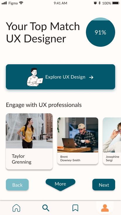
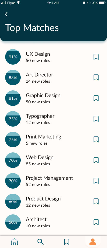
The theme of the explored task flow was a users barrier to discovery. “dabblr” looks to resolve this barrier by providing users with recommendations that might be outside a users scope of search by returning results that match who the user is rather than searching for careers based solely on their prevalence in society.
The underlying idea being that if a user is highly aligned with their career they will excel in it while also deriving a higher level of satisfaction from it. So regardless of the career’s prevalence in society - the user will be happier.
Future Thinking
Secondary Flow
Discovery is just the beginning of the solution. Without the ability to actually dabble in whatever career a user is matched with, ‘dabblr’ is incomplete and more importantly, hasn’t completely solved the issue of career misalignment.
The Matching Algorithm
The algorithm needs a large data set of responses from existing professionals. Such a data set does not exist at this point and would need to be generated to match the questions posed within the app.
Key Learnings
Carry your persona everywhere you go
It is very easy to get caught up in the design process and forget why we are doing all this work. I found that once I started to relate everything back to my persona, making decisions was much more straightforward and there was less work that needed doing twice.
Test, Test, Then Test Again… and Then Maybe One More Time
There are a lot of assumptions that we need to make to move forward. Which is why it is so important to be testing and validating each assumption as we progress through the design process. This prevents the need to redo any work already completed, which could cause a significant delay in any project.
Try it yourself
If you’re interested in finding out how the app really feels, you can give it a test drive by clicking below
